网页端电子时钟的2种实现方式
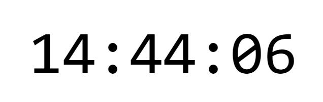
这篇文章主要介绍前端如何利用html+css+js实现数字电子时钟的2种方案,实现效果如下:
html部分如下:
<div class="time" id="time">
  <span class="hour"></span>
  <a class="split">:</a>
  <span class="minitus"></span>
  <a class="split">:</a>
  <span class="seconds"></span>
</div>
方案一:JS定时器
周期性的定时器setInterval方法,根据设定的时间周期进行执行代码或者代码块。
<style>
html,body{
    margin: 0;
    height: 100%;
    display: grid;
    place-content: center;
}
.time{
	display: flex;
	align-items: center;
	justify-content: center;
	font-family: Consolas, Monaco, monospace;
	font-size: 120px;
}
</style>
<script>
const hour = document.querySelector('.hour')
const minitus = document.querySelector('.minitus')
const seconds = document.querySelector('.seconds')
function getCurrentTime(){
	let date=new Date();
	let h=date.getHours();
	let m=date.getMinutes();
	let s=date.getSeconds();
	if(h<10) h='0'+h;
	if(m<10) m='0'+m;
	if(s<10) s='0'+s;
	hour.innerHTML=h;
	minitus.innerHTML=m;
	seconds.innerHTML=s;
}
getCurrentTime();
setInterval('getCurrentTime()',1000);//每秒更新一次时间
</script>
方案二:利用CSS属性
@property是一个新增的CSS @规则(CSS at-rule),它是CSS Houdini API的一部分, 它允许开发者显式地定义css自定义属性,并允许进行属性类型检查、设定默认值以及定义该自定义属性是否可以被继承。@property可以直接在样式表中注册自定义属性,无需运行任何JS代码;同时也配备相应的JS语法注册自定义属性。@property自定义属性,是CSS变量(CSS variables)声明变量的升级版本,比CSS变量更加规范和严谨。
<style>
@property --h {
    syntax: '<integer>';
    inherits: false;
    initial-value: 0;
}
@property --m {
    syntax: '<integer>';
    inherits: false;
    initial-value: 0;
}
@property --s {
    syntax: '<integer>';
    inherits: false;
    initial-value: 0;
}
html,body{
    margin: 0;
    height: 100%;
    display: grid;
    place-content: center;
}
.time{
    display: flex;
    align-items: center;
    justify-content: center;
    --step: 60s;
    font-family: Consolas, Monaco, monospace;
    font-size: 120px;
}
.split{
    animation: shark 1s step-end infinite;
}
.hour::after{
    counter-reset: hour var(--h);
    content: counter(hour, decimal-leading-zero);
    animation: hour calc(var(--step) * 60 * 24) infinite steps(24);
    animation-delay: calc( -1 * var(--step) * var(--dh) * 60);
}
.minitus::after{
    counter-reset: minitus var(--m);
    content: counter(minitus, decimal-leading-zero);
    animation: minitus calc(var(--step) * 60) infinite steps(60);
    animation-delay: calc( -1 * var(--step) * var(--dm));
}
.seconds::after{
    counter-reset: seconds var(--s);
    content: counter(seconds, decimal-leading-zero);
    animation: seconds var(--step) infinite steps(60);
    animation-delay: calc( -1 * var(--step) * var(--ds) / 60 );
}
@keyframes hour {
    to {
        --h: 24
    }
}
@keyframes minitus {
    to {
        --m: 60
    }
}
@keyframes seconds {
    to {
        --s: 60
    }
}
@keyframes shark {
    0%, 100%{
        opacity: 1;
    }
    50%{
        opacity: 0;
    }
}
</style>
<script>
	const d = new Date()
	const h = d.getHours();
	const m = d.getMinutes();
	const s = d.getSeconds();
	time.style.setProperty('--ds', s)
	time.style.setProperty('--dm', m + s/60)
	time.style.setProperty('--dh', h + m/60 + s/3600)
</script>
本文内容仅供个人学习、研究或参考使用,不构成任何形式的决策建议、专业指导或法律依据。未经授权,禁止任何单位或个人以商业售卖、虚假宣传、侵权传播等非学习研究目的使用本文内容。如需分享或转载,请保留原文来源信息,不得篡改、删减内容或侵犯相关权益。感谢您的理解与支持!