使用flex实现5种常用布局
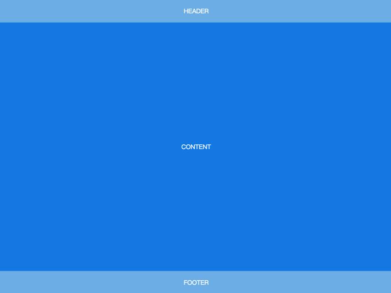
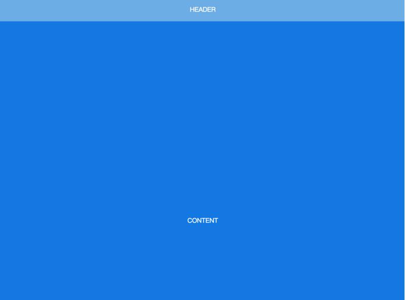
Sticky Footer
经典的上-中-下布局。
当页面内容高度小于可视区域高度时,footer 吸附在底部;当页面内容高度大于可视区域高度时,footer 被撑开排在 content 下方
<body>
  <header>HEADER</header>
  <article>CONTENT</article>
  <footer>FOOTER</footer>
</body>
body {
min-height: 100vh;
display: flex;
flex-direction: column;
}
article {
flex: auto;
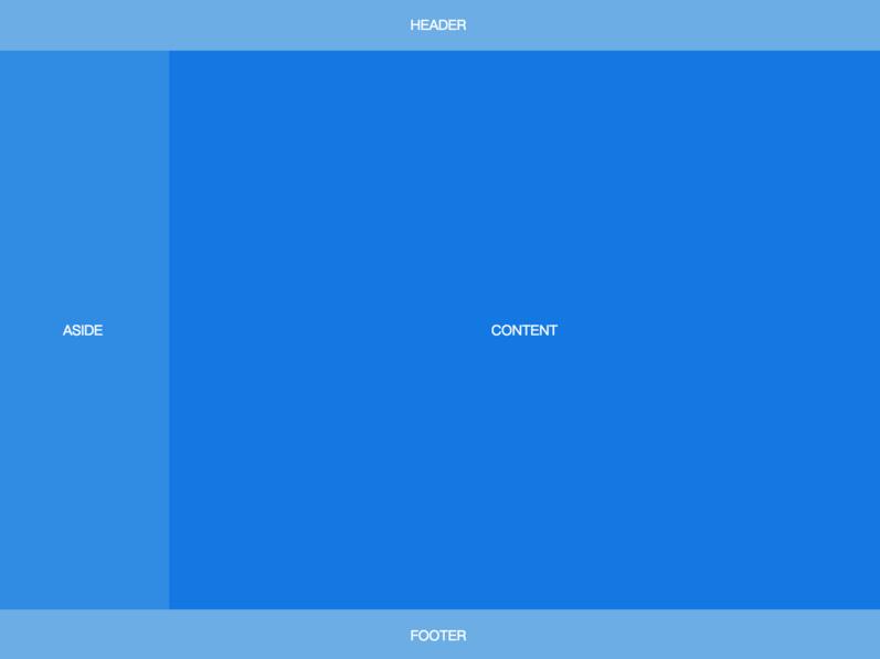
}Fixed-Width Sidebar
在上-中-下布局的基础上,加了左侧定宽 sidebar。
<body>
  <header>HEADER</header>
  <div class="content">
    <aside>ASIDE</aside>
    <article>CONTENT</article>
  </div>
  <footer>FOOTER</footer>
</body>
body {
min-height: 100vh;
display: flex;
flex-direction: column;
}
.content {
flex: auto;
display: flex;
}
.content article {
flex: auto;
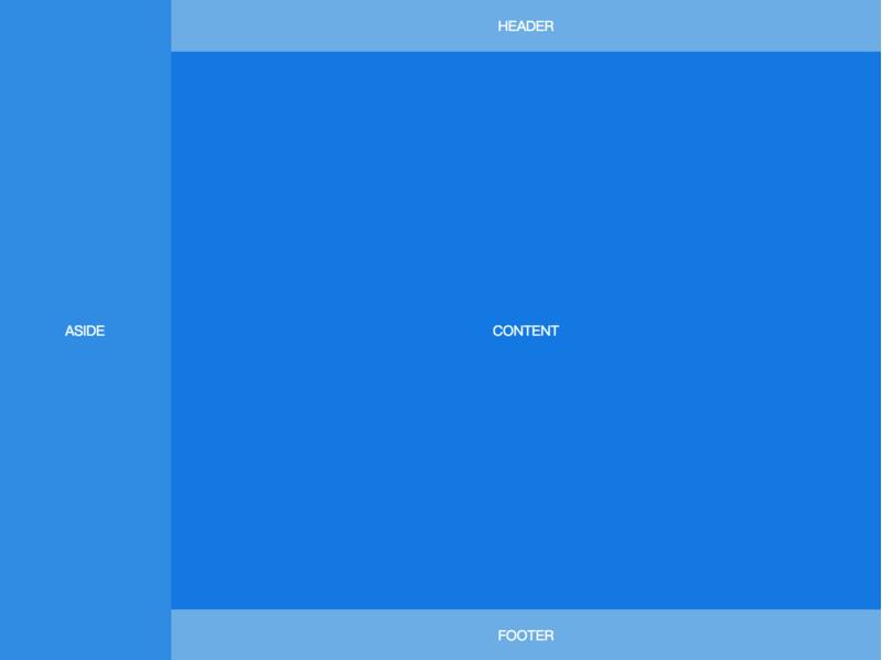
}Sidebar
左边是定宽 sidebar,右边是上-中-下布局。
<body>
  <aside>ASIDE</aside>
  <div class="content">
    <header>HEADER</header>
    <article>CONTENT</article>
    <footer>FOOTER</footer>
  </div>
</body>
body {
min-height: 100vh;
display: flex;
}
aside {
flex: none;
}
.content {
flex: auto;
display: flex;
flex-direction: column;
}
.content article {
flex: auto;
}Sticky Header
还是上-中-下布局,区别是 header 固定在顶部,不会随着页面滚动。
<body>
  <header>HEADER</header>
  <article>CONTENT</article>
  <footer>FOOTER</footer>
</body>
body {
min-height: 100vh;
display: flex;
flex-direction: column;
padding-top: 60px;
}
header {
height: 60px;
position: fixed;
top: 0;
left: 0;
right: 0;
padding: 0;
}
article {
flex: auto;
height: 1000px;
}Sticky Sidebar
左侧 sidebar 固定在左侧且与视窗同高,当内容超出视窗高度时,在 sidebar 内部出现滚动条。左右两侧滚动条互相独立。
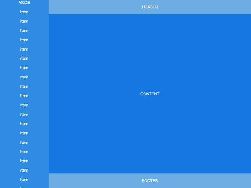
<body>
  <aside>
    ASIDE
    <p>item</p>
    <p>item</p>
    <!-- many items -->
    <p>item</p>
  </aside>
  <div class="content">
    <header>HEADER</header>
    <article>CONTENT</article>
    <footer>FOOTER</footer>
  </div>
</body>
body {
height: 100vh;
display: flex;
}
aside {
flex: none;
width: 200px;
overflow-y: auto;
display: block;
}
.content {
flex: auto;
display: flex;
flex-direction: column;
overflow-y: auto;
}
.content article {
flex: auto;
}
来源:https://github.com/meikidd/flex-layout
本文内容仅供个人学习、研究或参考使用,不构成任何形式的决策建议、专业指导或法律依据。未经授权,禁止任何单位或个人以商业售卖、虚假宣传、侵权传播等非学习研究目的使用本文内容。如需分享或转载,请保留原文来源信息,不得篡改、删减内容或侵犯相关权益。感谢您的理解与支持!