css垂直居中的几种实现方式
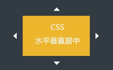
相比较水平居中,垂直居中比较复杂点。尤其是在实际页面中,有很多特殊的场景,导致水平居中实现起来比较麻烦。这篇文章旨在纪录一些我知道的居中方式。以一道经典面试题为例:一个200*200的div在一个div水平垂直居中,用css实现。
首先定义元素
<!--dom层:和垂直居中无关的样式直接定义在style里。-->
<body>
    <div class="margin" style="width: 500px;height: 500px;background-color: aqua">
        <div class="center" style="width: 200px;height: 200px;background-color: antiquewhite"></div>
    </div>
</body>
1.百分比的方式
缺点:必须知道居中元素的实际大小。根据实际大小用margin进行调整,因为top,left是以元素的上边框进行计算的。
<style>
    .center {
      position: absolute;
      top: 50%;
      left: 50%;
      margin-top: -100px;
      margin-left: -100px;
    }

    .margin{
      position: relative;    //外层元素必须定义为relative,否则是相对整个屏幕水平垂直居中
    }
</style>
2.百分比结合transform
优点:利用transform改良上面那种必须知道元素大小的限制。
<style>
    .center{
      position: absolute;
      top: 50%;
      left: 50%;
      transform: translate(-50%, -50%);
    }

    .margin{
      position: relative;
    }
</style>
3.flex布局
Flex布局(弹性布局),作为css3新增的布局方式,能很好的支持不同的屏幕大小,绝对是现在的前端工程师必备技能。
  <style>
    .margin {
            display: flex;
            justify-content: center;
            align-items: Center;
        }
  </style>
4.flex布局结合margin
    .margin{
            display: flex;
        }

    .center{
            margin: auto;
        }
5.绝对定位和0
    .margin{
            position: relative;
        }

    .center{
            overflow: auto;
            margin: auto;
            position: absolute;
            top: 0; left: 0; bottom: 0; right: 0;
       }
本文内容仅供个人学习、研究或参考使用,不构成任何形式的决策建议、专业指导或法律依据。未经授权,禁止任何单位或个人以商业售卖、虚假宣传、侵权传播等非学习研究目的使用本文内容。如需分享或转载,请保留原文来源信息,不得篡改、删减内容或侵犯相关权益。感谢您的理解与支持!