checkbox 样式美化
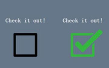
checkbox美化思路
checkbox无法直接改变样式只能通过连接到label标签来改变checkbox的样式,像checkbox或radio的美化,根本就不用插件了。
思路都一样的,先把之前的按钮透明度opacity设置为0 , 隐藏掉所有的Checkbox复选框后,我们需要添加一个label HTML元素,我们都知道,当点击的有for属性的label标签时,对应的Checkbox复选框会被选中。这意味着,我们可以通过label的点击事件来处理我们的Checkbox复选框。
然后就通过设置div的label,伪类等多种方式来实现了美化功能。下面会讲到2种与众不同的checkbox复选框样式。
checkbox美化样式一:

html:
<div class="mycheck">
    <input type="checkbox" value="1" id="checkbox1" name="">
    <label for="checkbox1"></label>
</div>
<div class="mycheck">
    <input type="checkbox" value="1" id="checkbox2" name="">
    <label for="checkbox2"></label>
</div>
css:
.mycheck {
	width:25px;
	margin:20px 100px;
	position:relative;
}
.mycheck input[type=checkbox] {
	visibility:hidden;
}
.mycheck label {
	cursor:pointer;
	position:absolute;
	width:25px;
	height:25px;
	top:0;
	left:0;
	background:#fff;
	border:2px solid #ccc;
	-moz-border-radius:50%;
	-webkit-border-radius:50%;
	border-radius:50%;
}
.mycheck label:after {
	opacity:0;
	content:'';
	position:absolute;
	width:9px;
	height:5px;
	background:transparent;
	top:6px;
	left:6px;
	border:4px solid #fff;
	border-top:none;
	border-right:none;
	-webkit-transform:rotate(-45deg);
	-moz-transform:rotate(-45deg);
	-o-transform:rotate(-45deg);
	-ms-transform:rotate(-45deg);
	transform:rotate(-45deg);
}
.mycheck input[type=checkbox]:checked + label {
	background:#f40;
	border:2px solid #f40;
}
.mycheck input[type=checkbox]:checked + label:after {
	opacity:1;
	background:#f40;
}
checkbox美化样式二
checkbox实现开关按钮的样式,如下:

html:
<div class='search_checkbox'>
        <input type='checkbox' id='switch'>
        <label for='switch'></label>
</div>
css:
.search_checkbox {
	margin: 0;
	padding: 0;
	height: 0.62rem;
	width: 1.02rem;
	display: flex;
	box-sizing: border-box;
}
.search_checkbox input[type=checkbox] {
	height: 0px;
	width: 0px;
	visibility: hidden;
}
.search_checkbox label {
	height: 0.62rem;
	width: 1.02rem;
	cursor: pointer;
	/* height: 20px; */
	border-radius: 0.5rem;
	display: inline-block;
	background-color: #C6CAD3;
	/* width: 40px; */
	text-indent: -99999px;
	position: relative;
}
.search_checkbox label::before {
	content: '';
	display: inline-block;
	background-color: #fff;
	height: 0.56rem;
	width: 0.56rem;
	position: absolute;
	top: 0.02rem;
	left: 0.02rem;
	border-radius: 50%;
	transition: 0.3s;
}
.search_checkbox input:checked+label {
	background: #2BA0FF;
}
.search_checkbox input:checked+label:before {
	left: calc(100% - 0.02rem);
	transform: translateX(-100%);
}
.search_checkbox label:active:before {
	width: 0.4rem;
}
注意点:这里使用的rem,相对布局,根据根元素font-size来确定适配大小的。
本文内容仅供个人学习、研究或参考使用,不构成任何形式的决策建议、专业指导或法律依据。未经授权,禁止任何单位或个人以商业售卖、虚假宣传、侵权传播等非学习研究目的使用本文内容。如需分享或转载,请保留原文来源信息,不得篡改、删减内容或侵犯相关权益。感谢您的理解与支持!